首先要有 flex container 然后里面的内容都是 flex item
flex item 提供了强大的功能,例如对其,控件的自动伸缩
先来个 flex container:
- display: flex; specifies a block-level flex container.
- display: inline-flex; specifies an inline flex container.
flex-direction container 的里 flex item 的方向
- row is, as previously stated, the initial value and directs the flow from left to right.
- row-reverse directs the flow from right to left.
- column directs the flow of items vertically from top to bottom.
- column-reverse directs the flow of items vertically from bottom to top.
默认的 flex item 的 order 都是 0 。order 就是顺序, 负数 -》 0 》 正数
.item1 { |
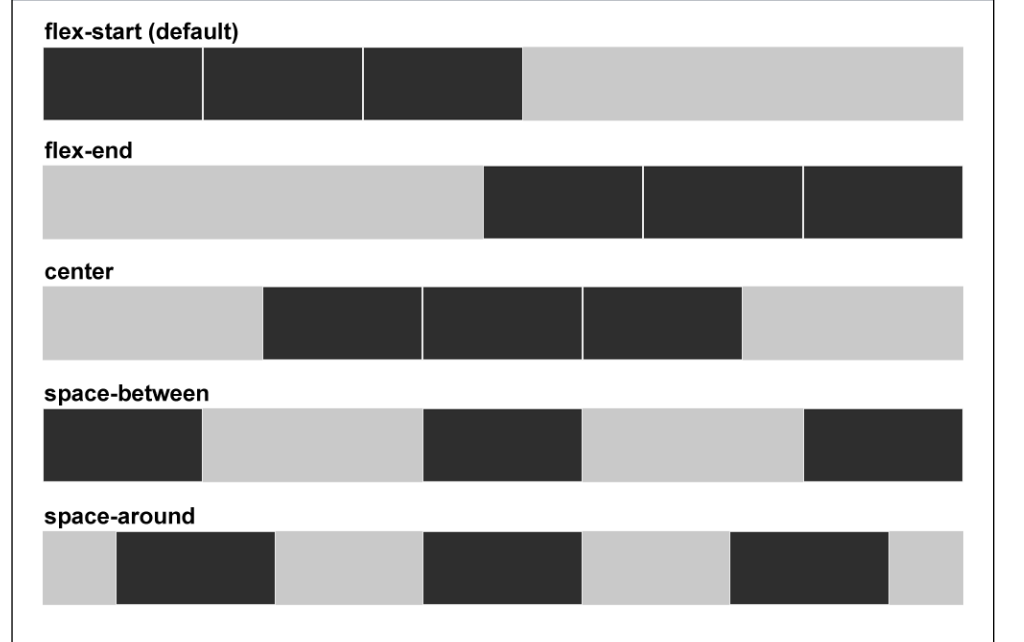
水平对其
justify-content
- flex-start 左对齐 靠容器最左开始
- flex-end 靠容器最右
- center flex item 都在容器居中
- space-between 第一个元素靠最左,最后一个靠最右,中间空间均分
- space-around 所有空间均分,都不贴左右边
align-items 是 item 间的关系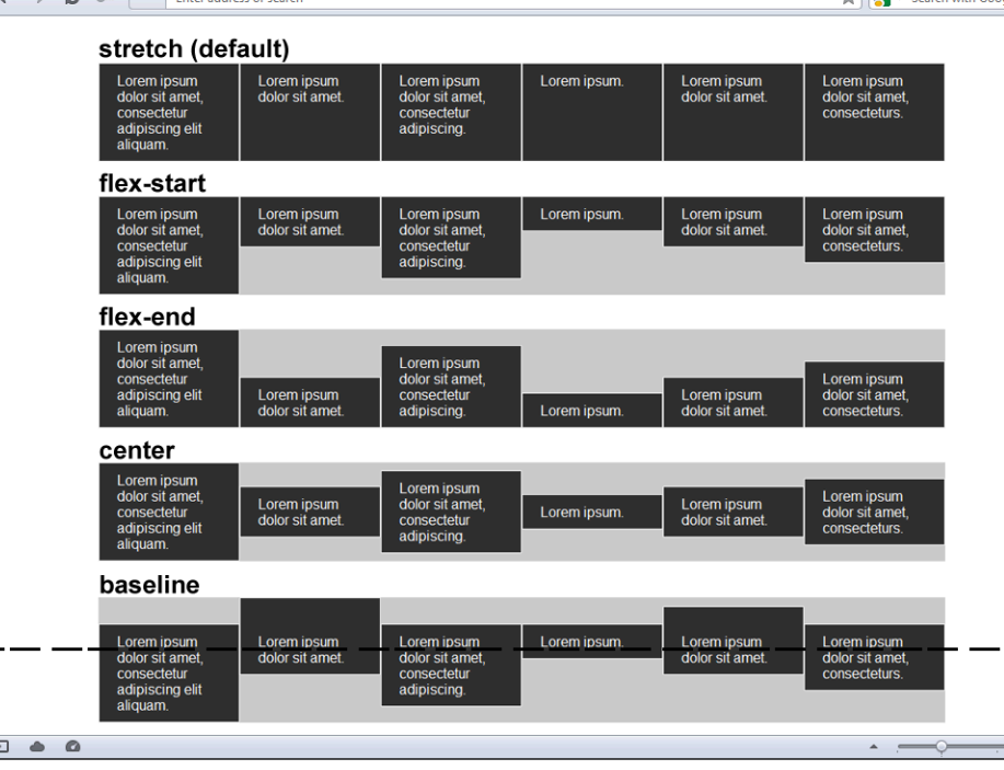
align-self 和 align-items 是一样的,不同时 align-item 是应用在整个 flex 上 align-self 可以单独给某个 flex item 加
http://codepen.io/justd/pen/yydezN
http://www.sketchingwithcss.com/samplechapter/cheatsheet.html
https://css-tricks.com/snippets/css/a-guide-to-flexbox/
其他的 layout 要注意 Grid 就好。。Regions 和 Exclusions 不知道有支持的没。。