Only three of the four transform types can operate in a 3D environment: rotate, translate, and
scale. This, of course, means that the skew() function is limited to 2D transformations.
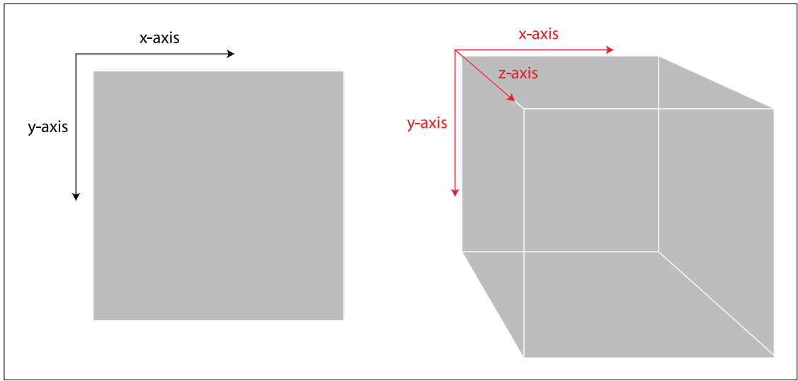
3d 就这样
div { |
围绕 x 轴旋转 45 度,但还是 2 维的,所以看起来只是高度小了:
想要 3D 效果,都在 perspective 属性
perspective 是指 离这个变化元素的距离,也就是增加了深度感,视角
perspective 越大就是观察者里这个元素越远,效果也就越接近 2D,越平面化
perspective 要设置在 3D 的容器元素上,不是要放在单个的元素上,这样能保持整个 3D 空间坐标系的一致
perspective 距离本质上和 z 轴的变化的是一样的 transform: translateZ(100px); / perspective:100px;
perspective-origin: 是观察者视角的 x y 偏移值
看上面的 3D 图, x 值越大就是说,人眼位置越靠右,y 越大就是越靠下面
perspective-origin 只能放在容易上。 所以整体空间视角的变化 perspective-origin 起了很大作用
perspective 只对 child 起作用,对 grandchild 不继承的
container 》 child -》 grandchild 想让 child 是 3D 就要在 container 上设置 perspective
想要 grandchild 是 3D 就要在 child 上设置 transform-style: preserve-3d;
transform-style: preserve-3d 就是让子元素是 3D 的
backface-visibility: hidden; 默认是 visible,hidden 的时候就是旋转 180deg 的时候是否还显示
##rotate3d 好难。。没理解
https://www.w3.org/Talks/2012/0416-CSS-WWW2012/Demos/transforms/demo-rotate3d.html
transform: translateX(100px) translateY(50px) translateZ(200px); 只是 x,y,z 左边的移动,还好
the scaleZ() function is then applied to this element’s container to move the entire 3D space closer to the viewer,
transform: scaleX(2) scaleY(1) scaleZ(3);
3d cube