偷取了这个 CSS 效果做了一个组件
原设计地址:
http://codepen.io/balapa/pen/vLzmmM
- 原设计尺寸位置都是固定的。css 做了一些改动,并且动画改动了下,没有做椭圆轨迹的移动。以后看能否加上
- 添加了基本的文字 overflow 的处理
- 和 Read More 按钮
- 箭头引用的是 awesome Font 的 lib
这个组件接受 3 个 inputs
- height
- width
- article 对象
都有默认值
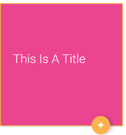
效果图:

源码地址 https://github.com/dreambo8563/CSS_Learning/tree/master/articleItem
基本使用 <animate height="600px" width="800px" [article]="article"></animate>
import { |
inputs 值的检查放到 OnInit 里,因为在构造的时候还是 undefined
@import url(https://fonts.googleapis.com/css?family=Roboto:400, 300, 500); |
<div class="cardRoot" [style.width]="_width" [style.height]="_height"> |